Android Different Screen Sizes Support
Android powers hundreds of device types with several different screen sizes, ranging from small phones to large TV sets. Therefore, it’s important that you design your application to be compatible with all screen sizes so it’s available to as many users as possible.
But being compatible with different device types is not enough. Each screen size offers different possibilities and challenges for user interaction, so in order to truly satisfy and impress your users, your application must go beyond merely supporting multiple screens: it must optimize the user experience for each screen configuration.
Explicitly declare in the manifest which screen sizes your application supports
By declaring which screen sizes your application supports, you can ensure that only devices with the screens you support can download your application. Declaring support for different screen sizes can also affect how the system draws your application on larger screens—specifically, whether your application runs in screen compatibility mode.
To declare the screen sizes your application supports, you should include the<supports-screens>element in your manifest file.
Add following code in
.manifest file:<supports-screens
android:smallScreens="true"
android:normalScreens="true"
android:largeScreens="true"
android:xlargeScreens="true"
android:anyDensity="true" />Provide different layouts for different screen sizes
By default, Android resizes your application layout to fit the current device screen. In most cases, this works fine. In other cases, your UI might not look as good and might need adjustments for different screen sizes. For example, on a larger screen, you might want to adjust the position and size of some elements to take advantage of the additional screen space, or on a smaller screen, you might need to adjust sizes so that everything can fit on the screen.
The configuration qualifiers you can use to provide size-specific resources aresmall,normal,large, andxlarge. For example, layouts for an extra large screen should go inlayout-xlarge/.
Beginning with Android 3.2 (API level 13), the above size groups are deprecated and you should instead use thesw<N>dpconfiguration qualifier to define the smallest available width required by your layout resources. For example, if your multi-pane tablet layout requires at least 600dp of screen width, you should place it inlayout-sw600dp/. Using the new techniques for declaring layout resources is discussed further in the section about Declaring Tablet Layouts for Android 3.2.
You need to create different layout for diff screen size. Support all screen you need to create following layout:
- Low density Small screens QVGA 240x320 (120dpi):
layout-small-ldpi (240x320) layout-small-land-ldpi (320x240) - Low density Normal screens WVGA400 240x400 (x432) (120dpi):
layout-ldpi (240 x 400 ) layout-land-ldpi (400 x 240 ) - Medium density Normal screens HVGA 320x480 (160dpi):
layout-mdpi (320 x 480 ) layout-land-mdpi (480 x 320 ) - Medium density Large screens HVGA 320x480 (160dpi):
layout-large-mdpi (320 x 480 ) layout-large-land-mdpi (480 x 320) - Galaxy Tab ( 240 dpi ):
layout-large (600 x 1024) layout-large-land (1024 x 600) - High density Normal screens WVGA800 480x800 (x854) (240 dpi):
layout-hdpi (480 x 800) layout-land-hdpi (800 x 480) - Xoom (medium density large but 1280x800 res) (160 dpi):
layout-xlarge (800 x 1280)
layout-xlarge-land (1280 x 800)
Provide different bitmap drawables for different screen densities
By default, Android scales your bitmap drawables (.png,.jpg, and.giffiles) and Nine-Patch drawables (.9.pngfiles) so that they render at the appropriate physical size on each device. For example, if your application provides bitmap drawables only for the baseline, medium screen density (mdpi), then the system scales them up when on a high-density screen, and scales them down when on a low-density screen. This scaling can cause artifacts in the bitmaps. To ensure your bitmaps look their best, you should include alternative versions at different resolutions for different screen densities.
The configuration qualifiers you can use for density-specific resources areldpi(low),mdpi(medium),hdpi(high), andxhdpi(extra high). For example, bitmaps for high-density screens should go indrawable-hdpi/.
The size and density configuration qualifiers correspond to the generalized sizes and densities described in Range of screens supported, above.
Note: If you're not familiar with configuration qualifiers and how the system uses them to apply alternative resources, read Providing Alternative Resources for more information.
At runtime, the system ensures the best possible display on the current screen with the following procedure for any given resource:- The system uses the appropriate alternative resource Based on the size and density of the current screen, the system uses any size- and density-specific resource provided in your application. For example, if the device has a high-density screen and the application requests a drawable resource, the system looks for a drawable resource directory that best matches the device configuration. Depending on the other alternative resources available, a resource directory with the
hdpiqualifier (such asdrawable-hdpi/) might be the best match, so the system uses the drawable resource from this directory. - If no matching resource is available, the system uses the default resource and scales it up or down as needed to match the current screen size and density The "default" resources are those that are not tagged with a configuration qualifier. For example, the resources in
drawable/are the default drawable resources. The system assumes that default resources are designed for the baseline screen size and density, which is a normal screen size and a medium density. As such, the system scales default density resources up for high-density screens and down for low-density screens, as appropriate.
| Screen characteristic | Qualifier | Description |
|---|---|---|
| Size | small | Resources for small size screens. |
normal | Resources for normal size screens. (This is the baseline size.) | |
large | Resources for large size screens. | |
xlarge | Resources for extra large size screens. | |
| Density | ldpi | Resources for low-density (ldpi) screens (~120dpi). |
mdpi | Resources for medium-density (mdpi) screens (~160dpi). (This is the baseline density.) | |
hdpi | Resources for high-density (hdpi) screens (~240dpi). | |
xhdpi | Resources for extra high-density (xhdpi) screens (~320dpi). | |
nodpi | Resources for all densities. These are density-independent resources. The system does not scale resources tagged with this qualifier, regardless of the current screen's density. | |
tvdpi | Resources for screens somewhere between mdpi and hdpi; approximately 213dpi. This is not considered a "primary" density group. It is mostly intended for televisions and most apps shouldn't need it—providing mdpi and hdpi resources is sufficient for most apps and the system will scale them as appropriate. If you find it necessary to provide tvdpi resources, you should size them at a factor of 1.33*mdpi. For example, a 100px x 100px image for mdpi screens should be 133px x 133px for tvdpi. | |
| Orientation | land | Resources for screens in the landscape orientation (wide aspect ratio). |
port | Resources for screens in the portrait orientation (tall aspect ratio). | |
| Aspect ratio | long | Resources for screens that have a significantly taller or wider aspect ratio (when in portrait or landscape orientation, respectively) than the baseline screen configuration. |
notlong | Resources for use screens that have an aspect ratio that is similar to the baseline screen configuration. |
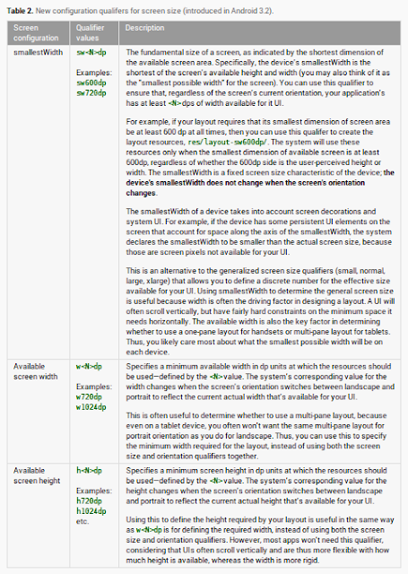
In addition to the traditional supports-screens parameters refer to the new Size Qualifiers launched in 3.2
The different resource configurations that you can specify based on the space available for your layout are summarized in table 2. These new qualifiers offer you more control over the specific screen sizes your application supports, compared to the traditional screen size groups (small, normal, large, and xlarge).
To help you target some of your designs for different types of devices, here are some numbers for typical screen widths
Using the size qualifiers from table 2, your application can switch between your different layout resources for handsets and tablets using any number you want for width and/or height. Here is an example from my own project where we were targets smallest device to large 10 inch tablets.
here is the screen Shoot of my own project structure.
 |
res/layout-small/main_activity.xml # All small Screen less than 240x320
res/layout-sw320dp/main_activity.xml # a typical phone screen (240x320 ldpi, 320x480 mdpi, 480x800 hdpi, etc)
res/layout-sw480dp/main_activity.xml # a tweener tablet like the Streak (480x800 mdpi).
res/layout-sw600dp/main_activity.xml # a 7” tablet like Nuxes 7 etc (600x1024 mdpi) .
res/layout-sw720dp/main_activity.xml # a 10” tablet like Nuxes 10, Galaxy Tab 10 etc
(720x1280 mdpi, 800x1280 mdpi, etc).
Hope this tutorial will help you for multiple screen supports.
Happpppy Coddddding :)
No comments:
Post a Comment